Converted Miniatures: Why They Don't Always Look "Right"
Hi everyone; I wanted to put together a post that details three key aspects of converted miniatures that can occasionally make a model feel 'off' if not addressed; these are simply my observations when it has come to my own conversions rather than anyone else's, but making sure I get these steps right helps silence my inner critic and all the anxieties that come with that.
Often, I find that when I convert or scratch build miniatures, this appears as an extra, more intense step than building them right out of the box. When assembling miniatures unconverted, it's usually quite a laid-back experience, but when attempting intense conversions, the process can be stressful due to things not going right and wasting precious rare bits. So hopefully this guide will allow for some basic ideas that will help you iron out your miniatures as you chop them up.
So, what does this all mean? Well, generally just keep converting and kitbashing. There are no rules, rules are out the window. Be as crazy as you want to be, please. But if that scathing inner-critic does ever come out to play and tells you that something just seems a little 'off', addressing these three main points usually does the job to silence mine.
Often, I find that when I convert or scratch build miniatures, this appears as an extra, more intense step than building them right out of the box. When assembling miniatures unconverted, it's usually quite a laid-back experience, but when attempting intense conversions, the process can be stressful due to things not going right and wasting precious rare bits. So hopefully this guide will allow for some basic ideas that will help you iron out your miniatures as you chop them up.
Faces & Bases:
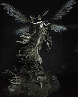
Commonly preached about when painting miniatures are faces and bases; they're often said to be the two things to get right while painting a miniature as they are more often than not, the focal points of the miniature and the thing that you and your opponents will remember while glancing at them on the tabletop. I agree that this is important, but I think it is equally true when converting miniatures, and is a skill that is hard to master, especially when it comes to choosing heads. This isn't an issue at all when you're not converting miniatures and are just glueing them on a base with sand, as the designers have made these choices for you, but when essentially designing your own model's aesthetics, it's one of the most important aspects to consider and can owe to why miniatures might feel off. Placing the wrong head on a great converted torso can ruin that torso. I think an example of this can be found in my Deepkin project and is something I've tried to rectify in my Cities of Sigmar; with my earlier Deepkin models, special attention was given to finding 'siren' like heads for the models, while as the project reached its end, some of the riders ended up with mohawks.
Choosing the right head I think applies to all models too, human, alien or ghost, but even more so to miniatures that aren't built for headswaps. Space Marines and Stormcast Eternals have nice little dips where their helmets go, so any mess around the neck joint is hidden, whereas models like The Unmade from Warcry have necks and lower jaws that flow into the head pieces and therefore can be trickier to work around. I think it's very important to not take the cheap option and just use a head from your bits box that looks 'eh' if you can afford to, as finding the perfect head can make a perfect conversion.
On the subject of bases, as time has moved on, I've become more and more partial to plain or flat bases, especially when framing a highly converted model as it leaves more room for the model to breathe. There's an exception to every rule, however; @Ingrimmson does some crazy bases that act as extensions of his crazy conversions and pulls it off spectacularly. However, when making a warband or army, having one or two models on scenic bases and the rest on flat bases can feel jarring and is a difficult thing to keep up as the army moves on. This is something that I found with my Untamed Beasts for Warcry; I was so enthusiastic to give them all scenic bases that with the rest of the Warcry collection, they can feel a little too tall or out of place.
 |
| The Untamed Beasts in question |
Weapons:
I think this is more of an issue I've found with models in the Blanchitsu and Grimdark community (so, mine), and I think it's sprouted from Blanchitsu Warbands slowly turning into armies--a trend of which has started over the past couple years. As we've turned our heads to making out miniatures more viable in larger games, we've had to make them WYSIWYG and thus, hold weapons and artefacts that we might've not given them if not for them being present in the model's ruleset. A lot of the time, this is fine, such as in minimal conversions/ weapon swaps on a unit of Greatswords for example.
Sometimes, however, I think having to go WYSIWYG can betray fundamental design philosophies of the aesthetic individuals are going for in their Grimdark armies. You can see this for example, in my Sylvaneth Arch Revenant, which I gave a giant axe just so it had a large weapon to fit the profile. In hindsight, this contradicts my vision of the lithe and rounded Sylvaneth.
 |
| Arch Revenant |
This can also be an issue when it comes to converting large units from scratch; if you want to build a coherent unit of 20 models, each with bespoke weapons, heads and accessories, you'll want them to all have the same weapon designs to make them feel coherent and represent their rules, but this can get expensive. This was fine for my Phoenix Guard as I was able to get Sigmarite Axe heads fairly easily, but for my Sisters of the Watch, I only had 18 fiery bows for 20 models and had to give the unit champions wooden bows. They look fine, but they bother me because they're supposed to be on fire!
This issue of wargear can also be a problem when it comes to more flamboyant heroes; I'm planning to convert the new Lumineth witch hero into a Nomad Prince for my Cities of Sigmar, but the Prince, as per his warscroll, is armed with a spear and shield, which contradict design elements of the base model in my opinion and also occupy the model's hand space where I'd rather her be holding some more characterful items. Either I betray the model's design philosophy by including the weapons or betray the model's rules by ignoring them.
I think the third solution to this, however, is giving models smaller weapons that echo cues and symbology of the model's rules. I think this is how I will approach the Prince; I'll give her models that give cues leading to the idea of a Starlight Spear in the form of a sharpened mage staff or something similar. Miniatures, it can be seen, exist not to portray every aspect of their background and character, but instead as a visual shorthand for their traits and weapons. This can be seen clearly in the Awakened Wyldwood--obviously, three trees are not a forest, but the visual shorthand of clustered trees provide enough for players to intuit what the miniature is supposed to represent.
Active or Passive?
One of the primary things I try to decide when creating a model, especially a character, if it's going to be in an active or passive pose; all characters ideally should be subjects rather than objects, so it's less the difference between a Servitor and a Space Marine, but more that between a character fighting tooth and nail in single combat or a tactician/ mage standing quietly on the back lines. What's most important from this differentiation is whether or not the model's activity or passivity betrays the essential nature of its role and character. The abovementioned Lumineth mage is a great example, as she is quiet and serene, not intent on moving, and yet that fits her character of being a mage who deals in emotions rather than hand-to-hand combat. Another successful example I believe in is my own Treelord, a monstrous character stalking through the forest; clearly powerful, as shown by its bulk, but more pitiful and creepy than a monster of brute force.
 |
| My Treelord |
On the other side of the coin, however, I would argue that a frequent issue I see with the way Devastator Centurions are built has to do with the posing; they're supposed to be indomitable walkers, constantly shooting as they march, but the miniatures are commonly built as if they are ambling with their weapons lowered, and thus, this contradicts with the essential nature of their character. They are passive when they are supposed to be active. I believe this can also be seen in my own Deathmark Sniper I made for Killteam. I'm very proud of the conversion and the paint job, but the model is seemingly leaping into action, whereas I always imagine Necrons, especially Necron Snipers, as lying in wait, almost never moving, part of the terrain, and therefore, the conversion is too active. I think this general rule affects some models more than others; some models look fine in resting poses when they're supposed to be charging, but for some miniatures, it can ruin the immersion.
 |
| My Deathmark |
So, what does this all mean? Well, generally just keep converting and kitbashing. There are no rules, rules are out the window. Be as crazy as you want to be, please. But if that scathing inner-critic does ever come out to play and tells you that something just seems a little 'off', addressing these three main points usually does the job to silence mine.
Thanks for reading.


Comments
Post a Comment